Give

GIVE
No, sorry.
You can't donate to this website or to me.
I just wanted to GIVE feedback about the 'GIVE' button on church websites.
In attempting to send prayer requests to churches about my idontwantgod.com project,
I actually encountered one website that contained only the following:
1) The name of the church
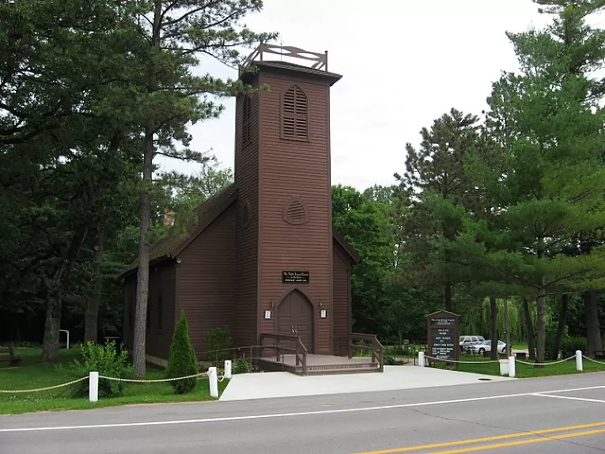
2) A photo of the church
2) A photo of the pastoral couple
4) The 'GIVE' button.
That was it.
That was all.
That was everything.
AND.....I ran into several, many websites where the only computer-contact possible
with that church - was through the 'GIVE' button.
No e-mail contact was offered; impossible, apparently by design and forethought.
Suggestion #1: The 'GIVE' button should be on the upper far right and without special highlighting,
so it doesn't appear to be the most important topic on the header.
Suggestion #2: A church that doesn't offer email contact on their website,
shouldn't have a 'GIVE' button. That is sooooo one-sided.
Thank you for reading this.